Corporate Design
Logo
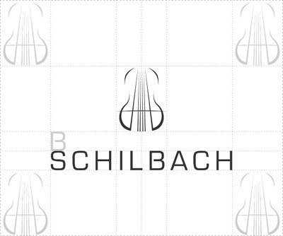
A(lexis) S(chilbach), the initials of the violin maker and company founder, combined with the abstraction of a violin, are the components of the pictorial logo. The font logo, on the other hand, is designed in such a way as to allow an association with classical composer J. S. BACH. The overall logo shows precision and high quality due to fineness and symmetry.

Claim
The second-place claim signe d'excellence or sign of excellence stands for the core customer premises. Firstly, SCHILBACH the studio is located in Western Switzerland, and is therefore located in the French-speaking area, which also provides a large number of customers. The increasing international reputation underlines the claim in its English counterpart.
Colour scheme
Central Asia, where the play of bow strokes is documented for the first time in writing and pictures, is not only expressed in the background with the concept of this studio, but is also an integral part of the logo.
The sandy brown of the steppe, which largely makes up the background color of Central Asia, is also included in the coloring of the logo. The high-quality brown also promotes a mental connection to quality violins or strings.